Editorial Brand for a Science-Led Dietitian
BUILDING AUTHORITY in the nutrition industry
Kelsey is a dietitian in Ireland who works from tested, science-backed methods and takes a no-nonsense approach with her clients. She needed a brand that matched how she actually works, and a site she could update without dreading it.
Our approach
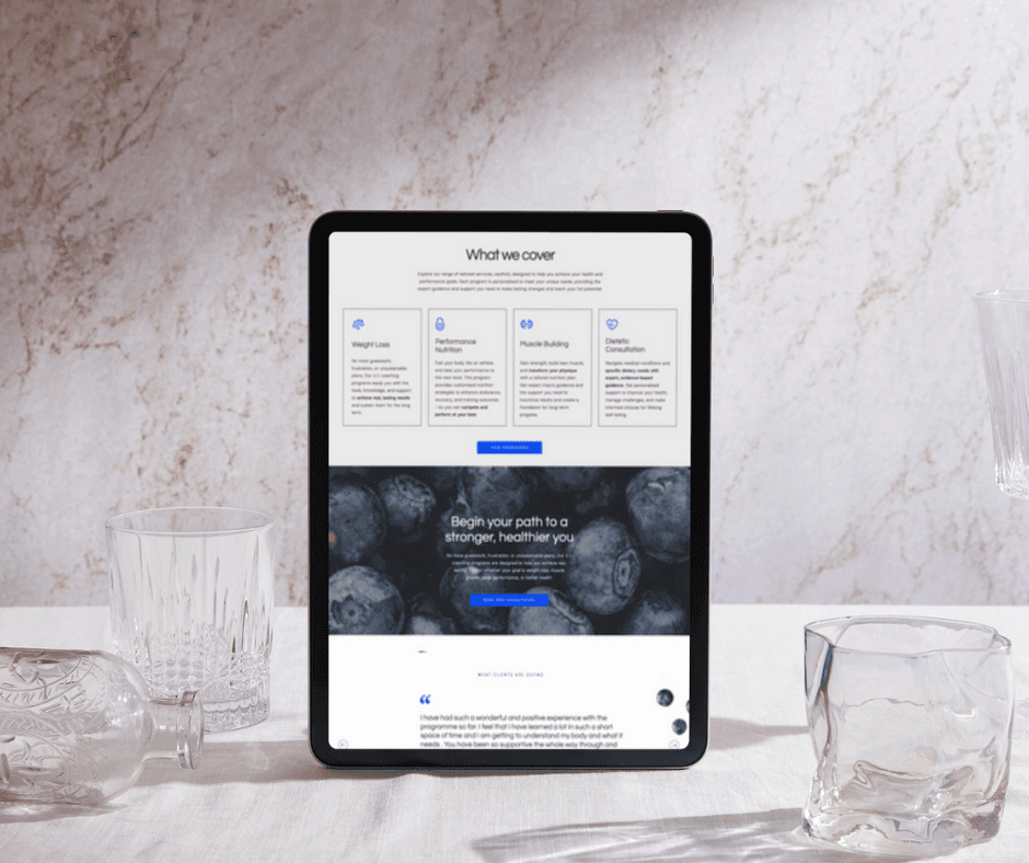
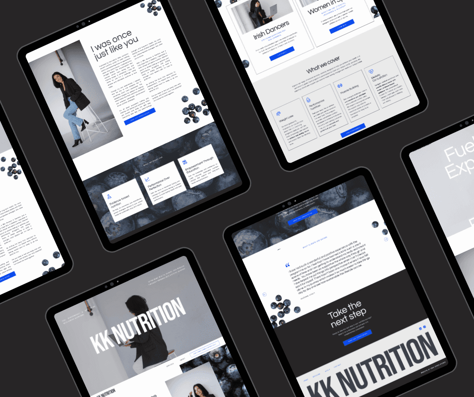
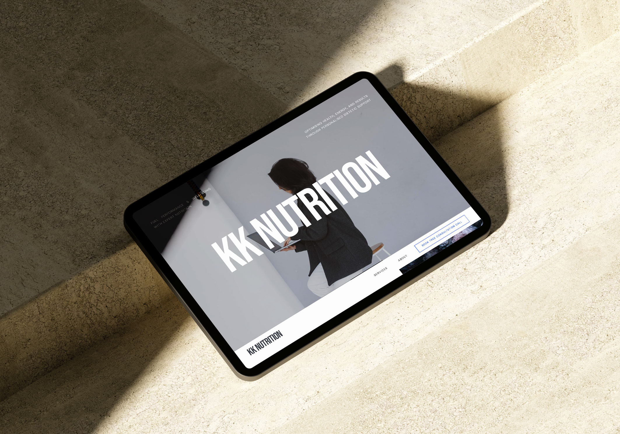
We went editorial and bold rather than soft and calming, which is the default in this category and the reason nobody stands out in it. Electric blue against heavy black gives the palette its authority and reflects the elevated feeling Kelsey wants her clients to walk away with. Questrial for headings paired with Host Grotesk for body keeps the type sophisticated without decorating anything. The KK monogram carries her elegance in a mark that works as small as a favicon. Built in Showit so she can edit it herself.
The result
The site now does Kelsey's filtering for her. It attracts the clients who want a direct, evidence-led practitioner and quietly turns away the ones who do not, which saves her the time she was losing to bad-fit enquiries. Every touchpoint carries the same message, so she is not re-explaining herself to each new prospect. Adding an offer or shifting her niche no longer means starting over.